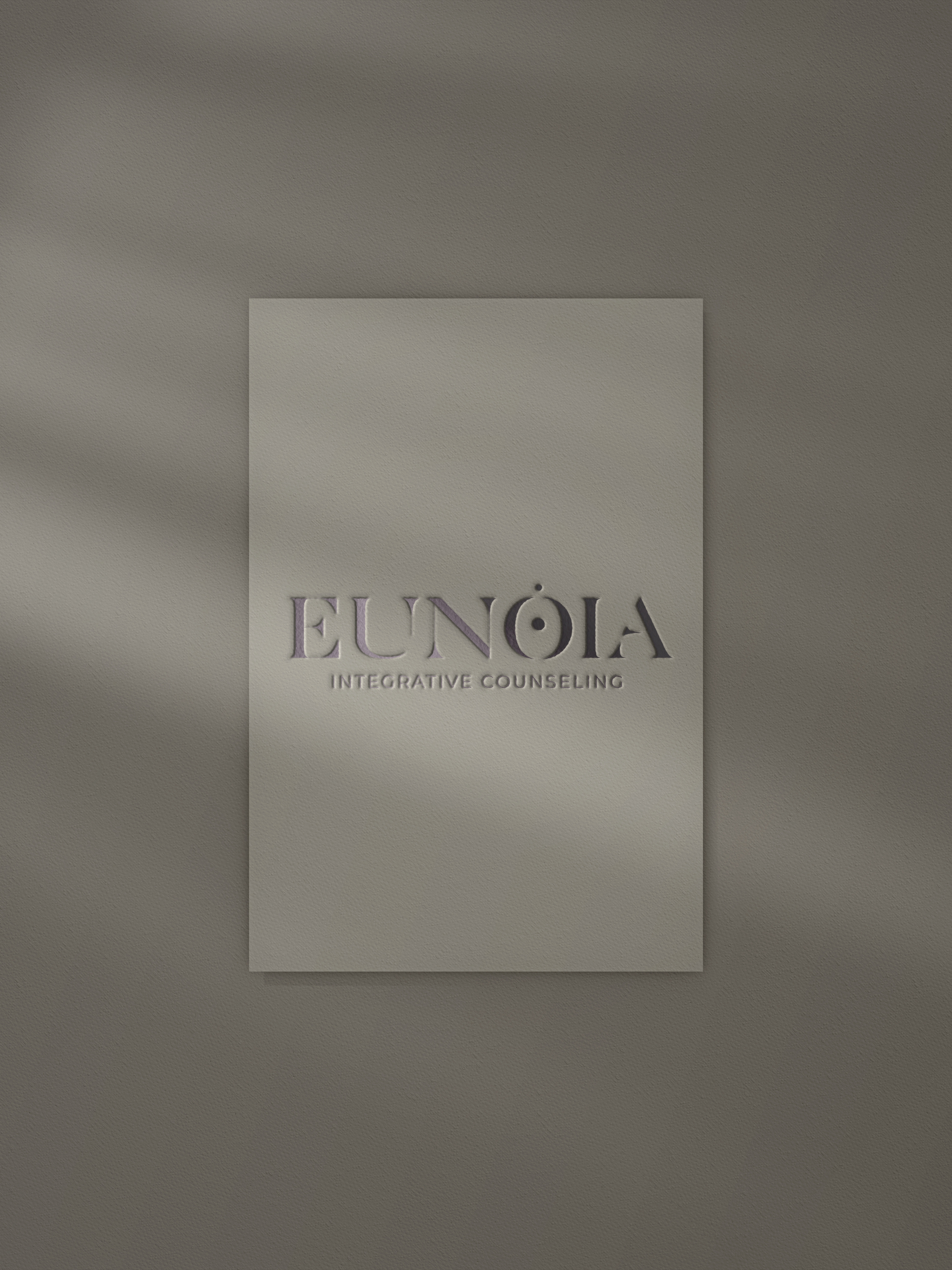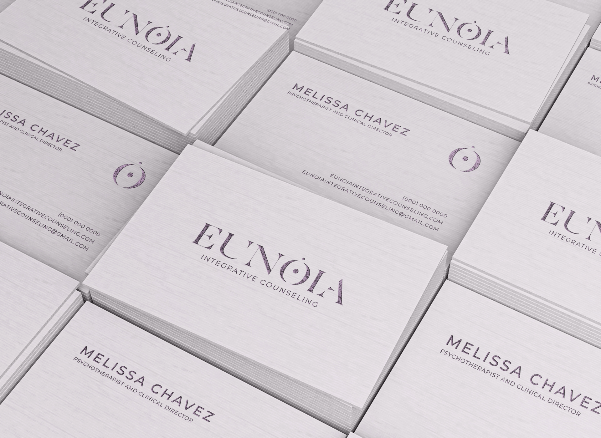

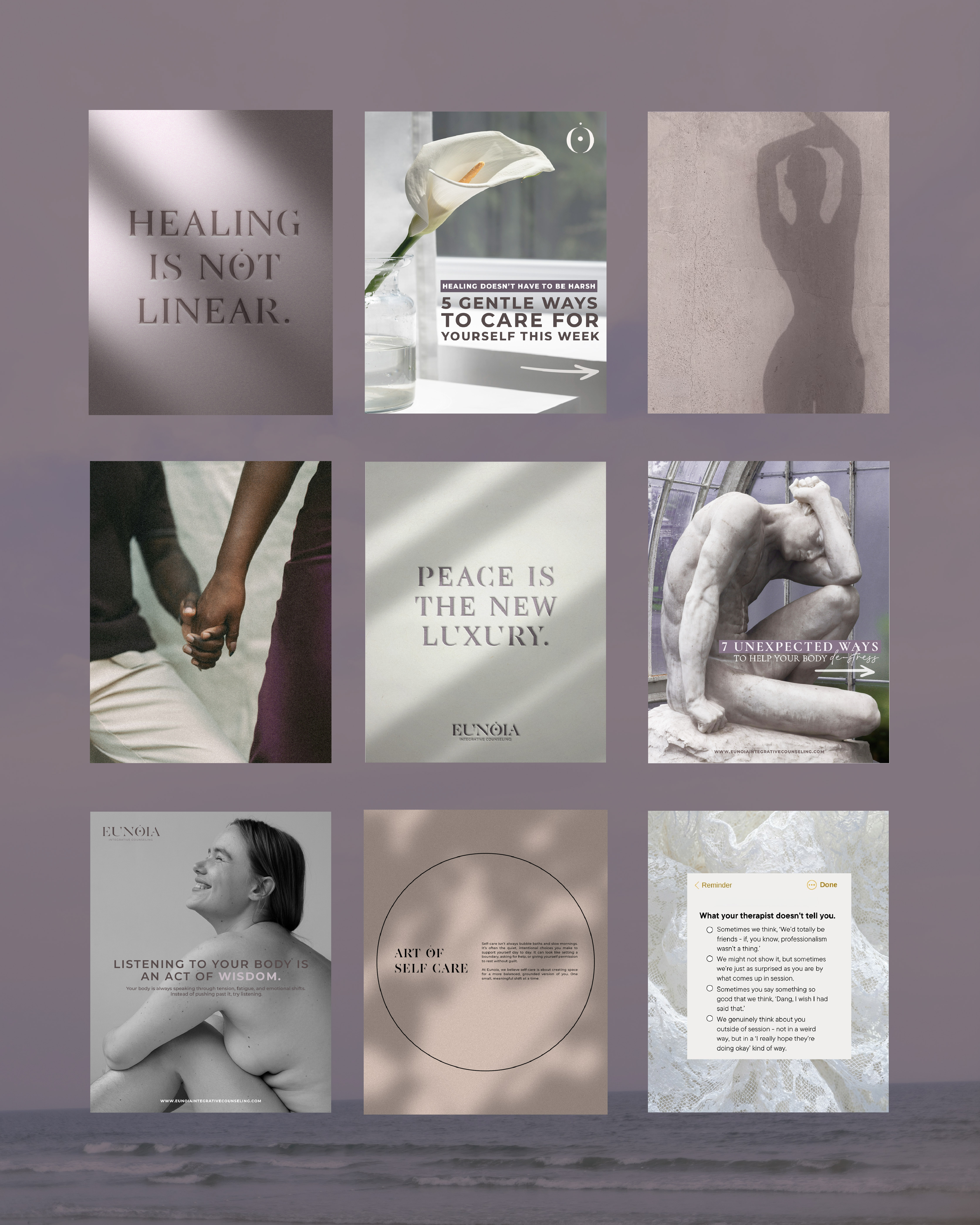
The brand direction centered on creating a light, airy, and grounded visual language rooted in soft, muted purple tones. Purple was intentionally chosen not only for its association with introspection, wisdom, and emotional depth, but also to subtly appeal to the practice’s primary audience WOMEN while avoiding overly saturated or traditionally “feminine” tones that could feel exclusionary. The goal was to strike a balance: creating something that felt inviting and aligned with the all-women team, without alienating male clients or anyone outside that core demographic. This tonal restraint allowed the palette to feel inclusive, calming, and universally approachable.
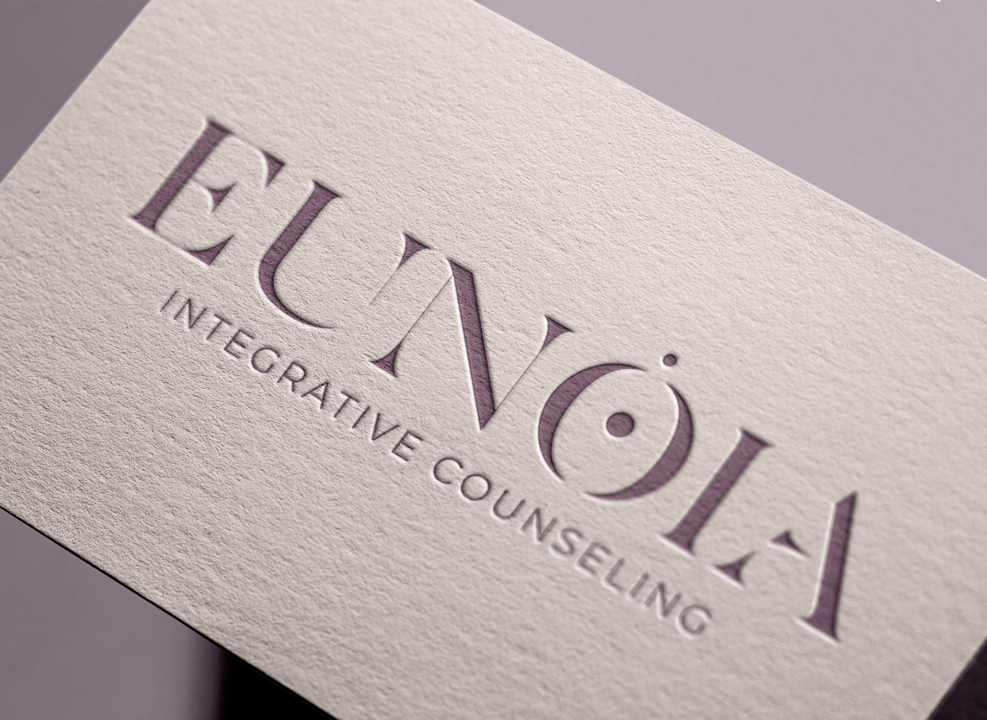
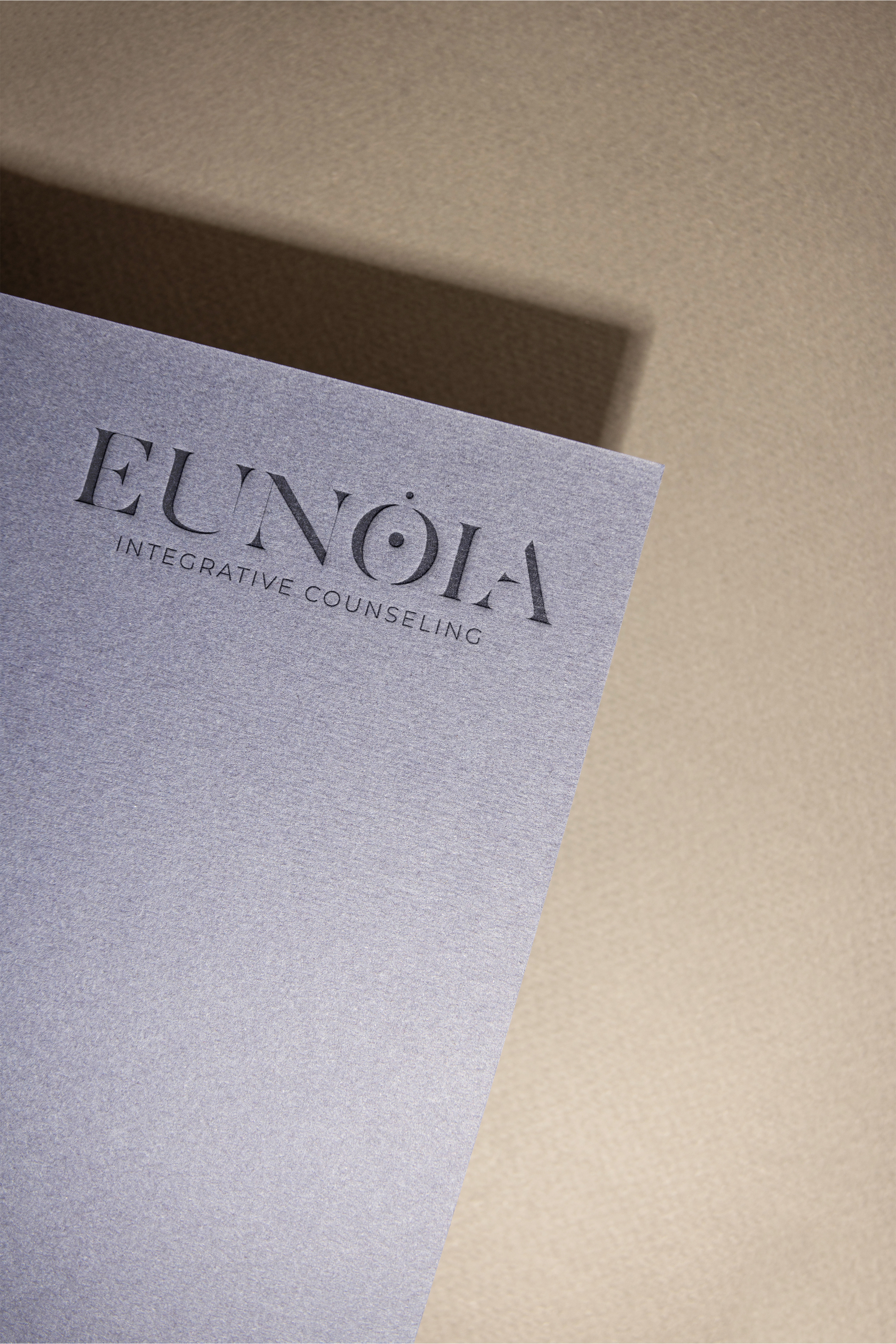
I selected a unique typeface and customized it to feel distinctly ownable: originally composed of separated shapes, I connected them with delicate vector lines to symbolize fragmentation being brought back into wholeness through therapy. The icon further reinforces this idea: two halves forming a balanced whole subtly integrated into the “O” in EUNOIA while remaining strong enough to stand alone. The name “EUNOIA,” meaning “beautiful thinking,” became the conceptual anchor for the entire system, tying together harmony, clarity, and emotional integration. The overall design approach embraced minimalism, clean, restrained, and intentional allowing the brand to hold space rather than overwhelm it.
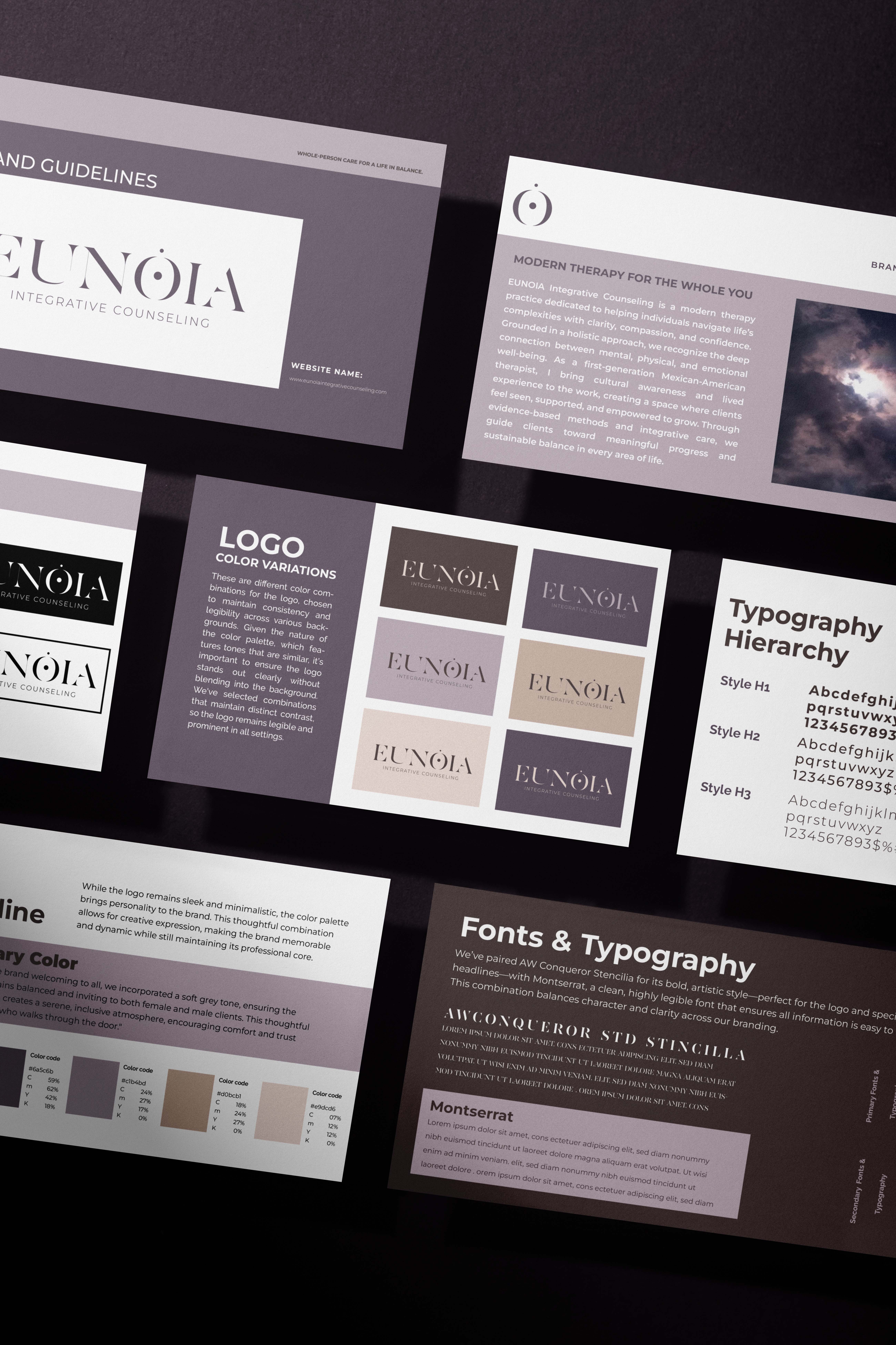

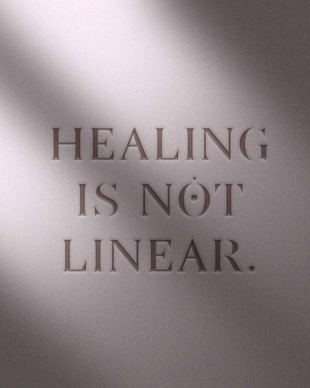
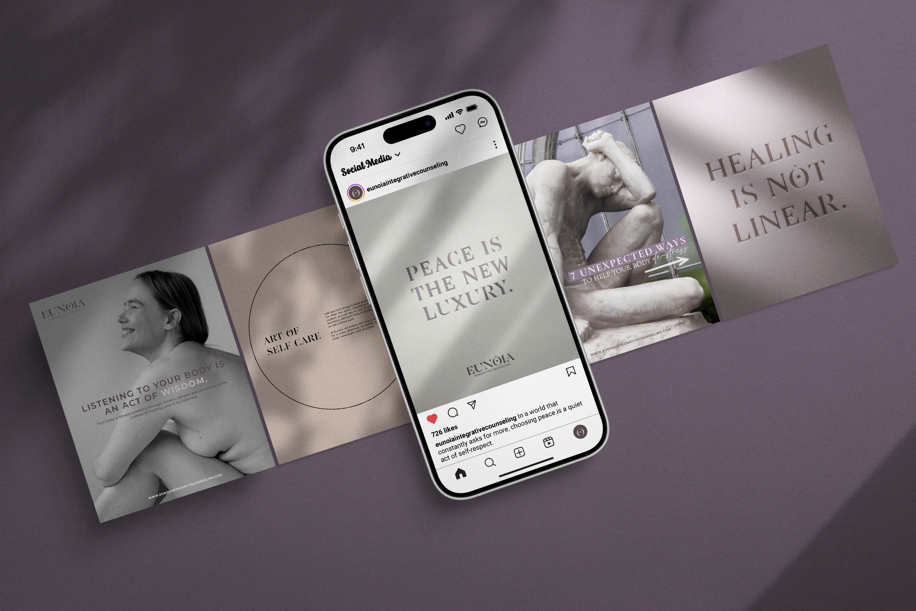
The final brand system feels cohesive, elevated, and aligned with the practice’s values. It communicates calm, clarity, and trust while maintaining a strong, recognizable identity across touchpoints. Deliverables included a full brand identity system, logo suite, iconography, color palette, and a comprehensive brand book along with ongoing design support for marketing materials like flyers. Beyond visual assets, I’ve also worked closely with the founder to guide the practical application of the brand across marketing and social media, ensuring consistency and longevity. The result is a brand that not only looks refined but functions as a true extension of the therapeutic experience. Inviting, grounded, and quietly powerful.