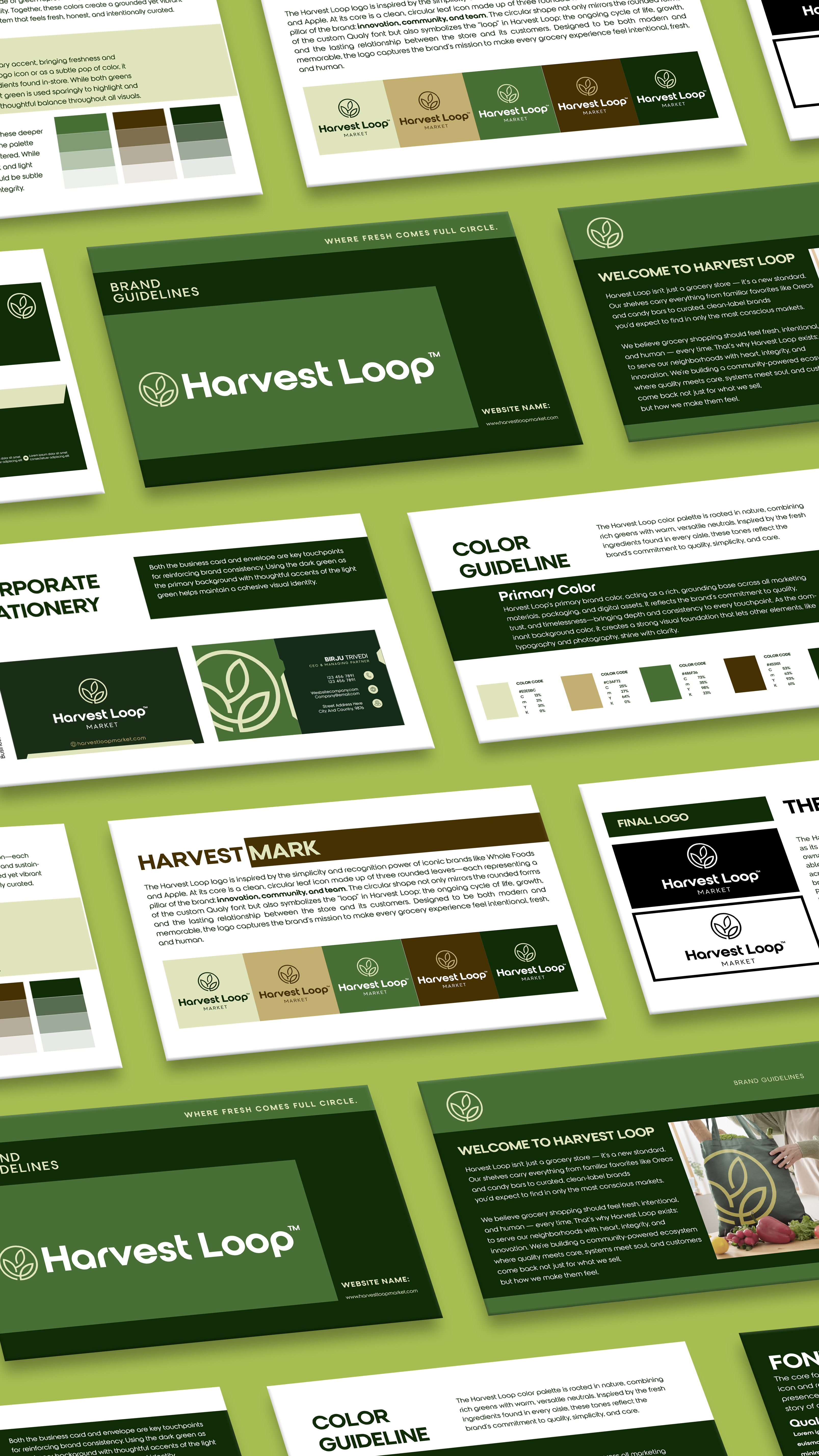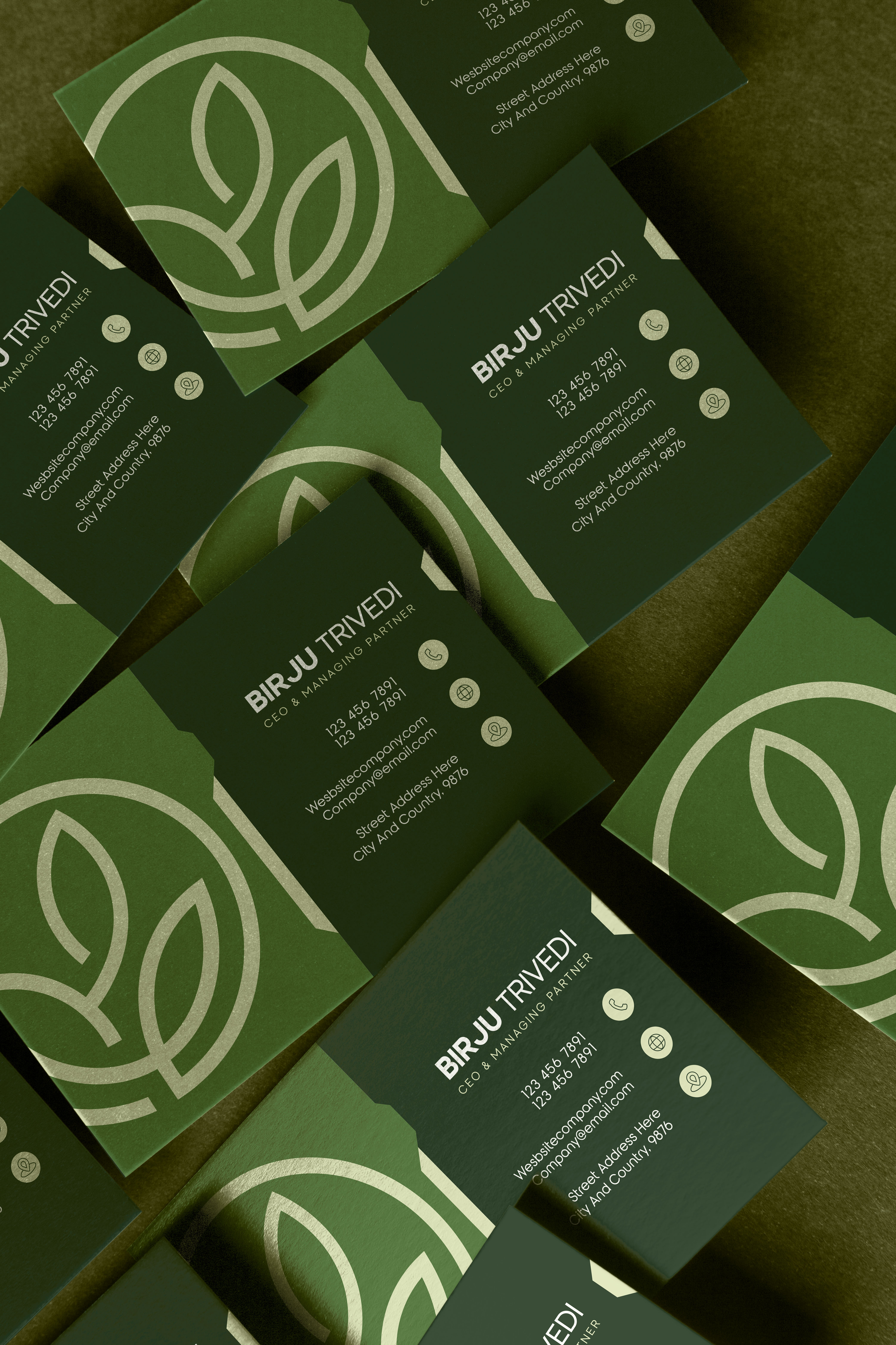
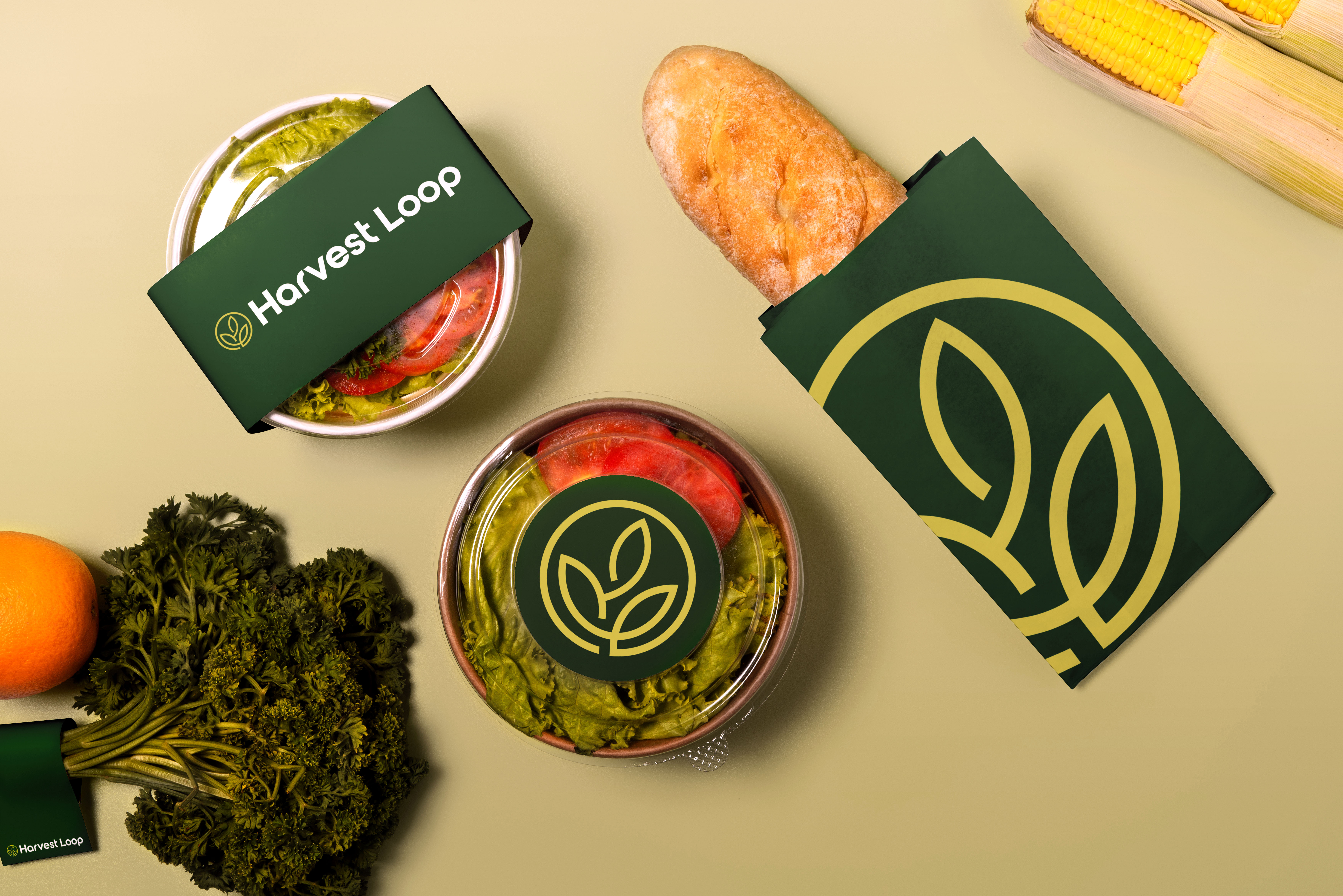
I developed the visual identity for Harvest Loop with a focus on creating a clean, recognizable, and flexible brand system. The identity was designed to communicate quality and simplicity while reflecting the store’s commitment to thoughtfully sourced food, local makers, and a human-centered grocery experience.
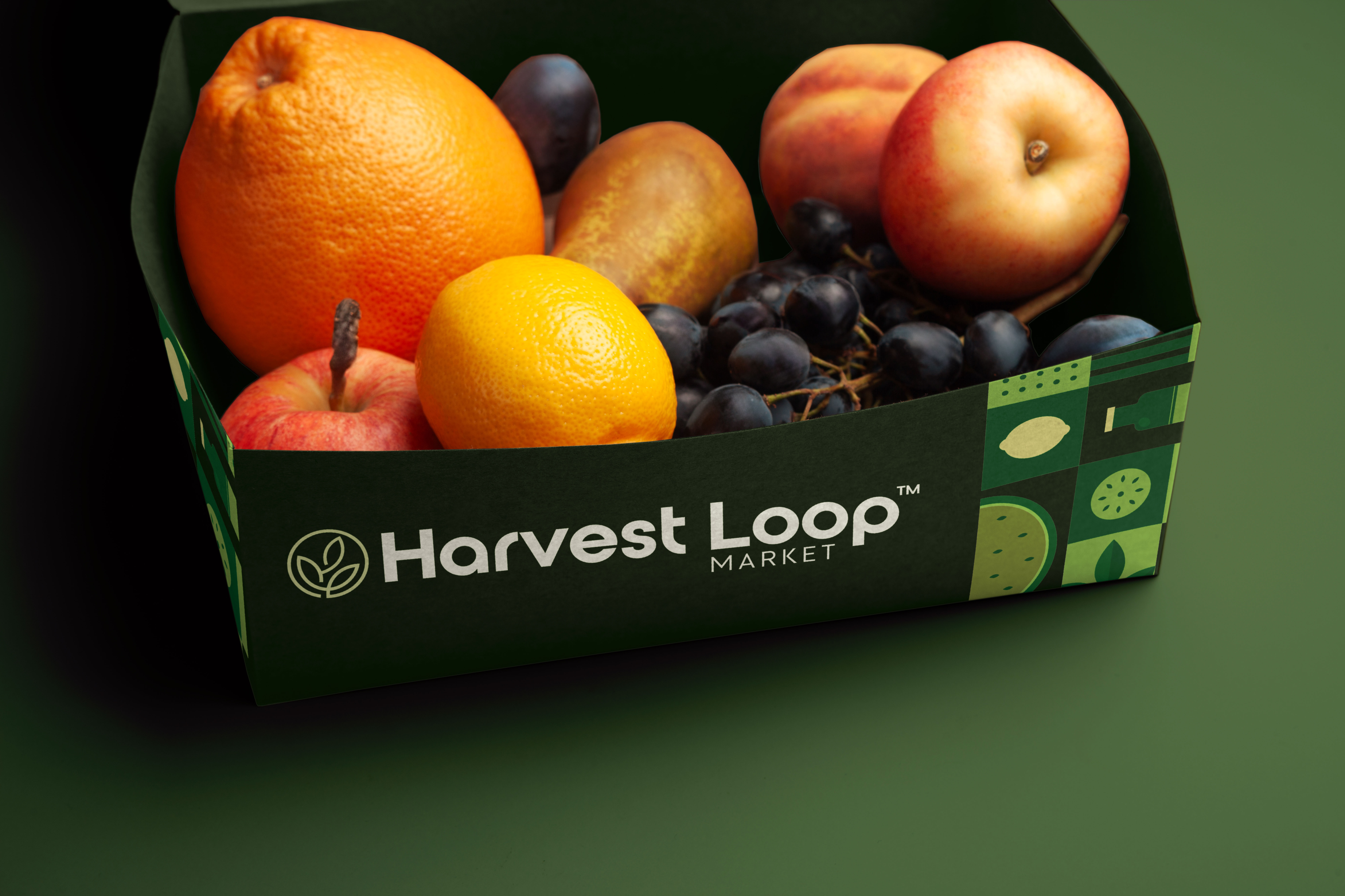
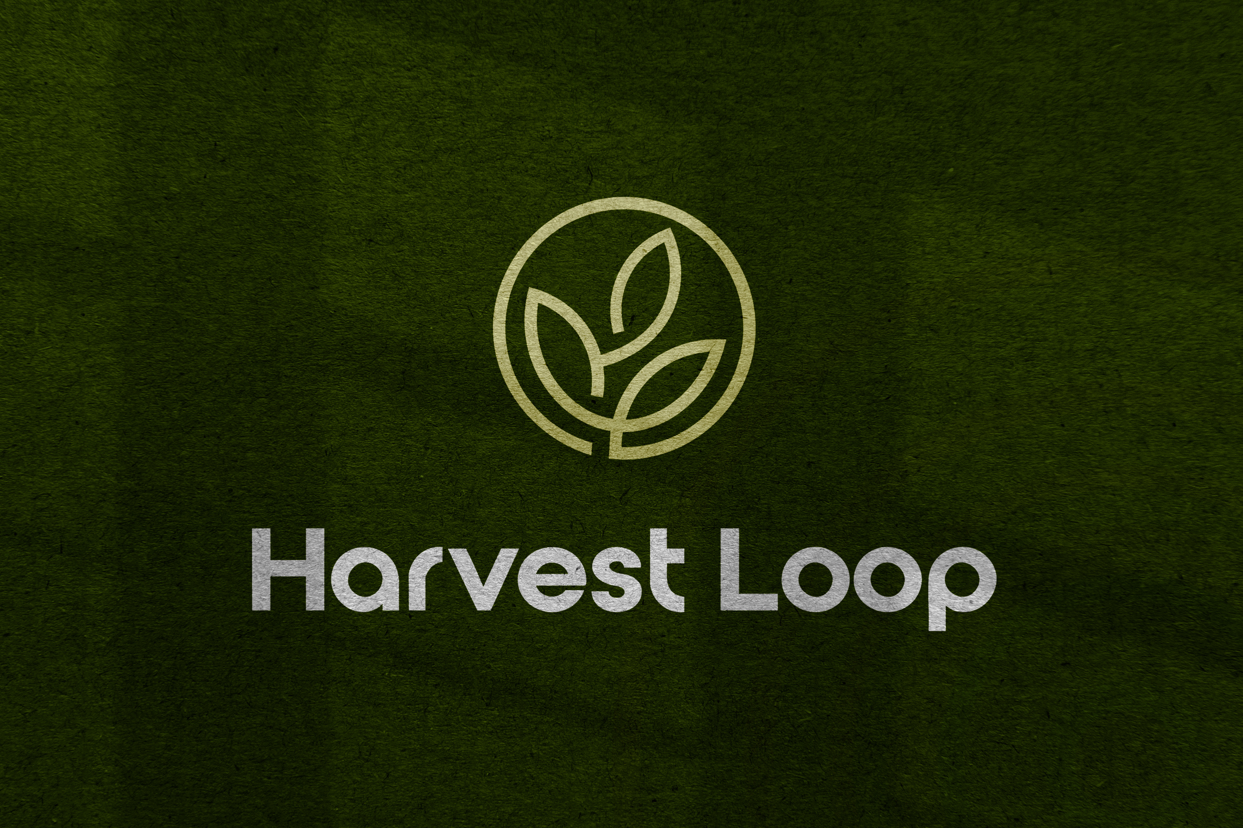
The logo centers around a bold three leaf icon, a key requirement from the client, formed into a continuous loop to represent the Harvest Loop name and the idea of an ongoing connection between food, people, and community. Rounded typography echoes the circular shape of the icon, while a traditional green and beige palette is energized by a bright yellow-green accent. The bold, scalable system was intentionally built to work across storefront signage, packaging, and future product applications.
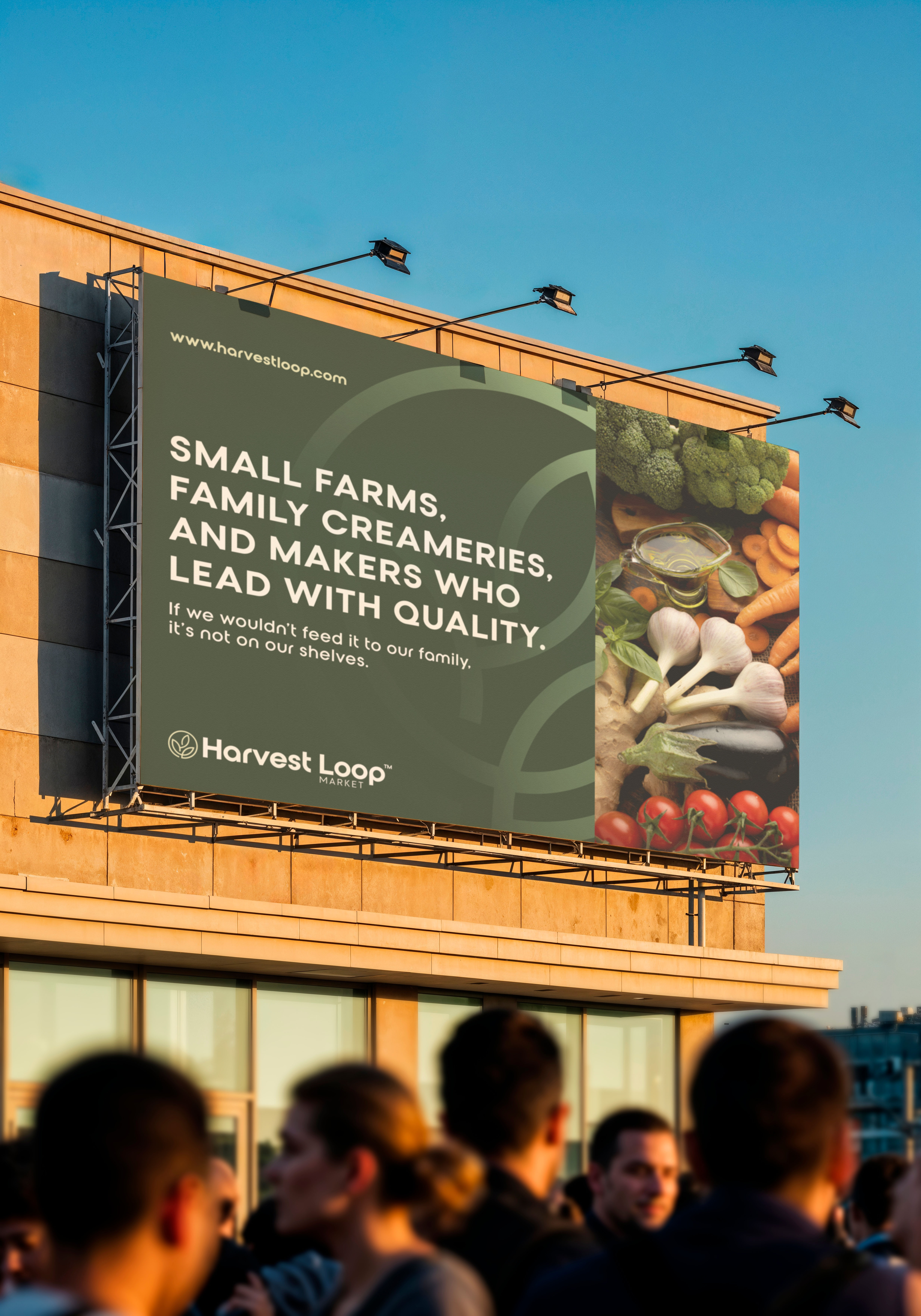
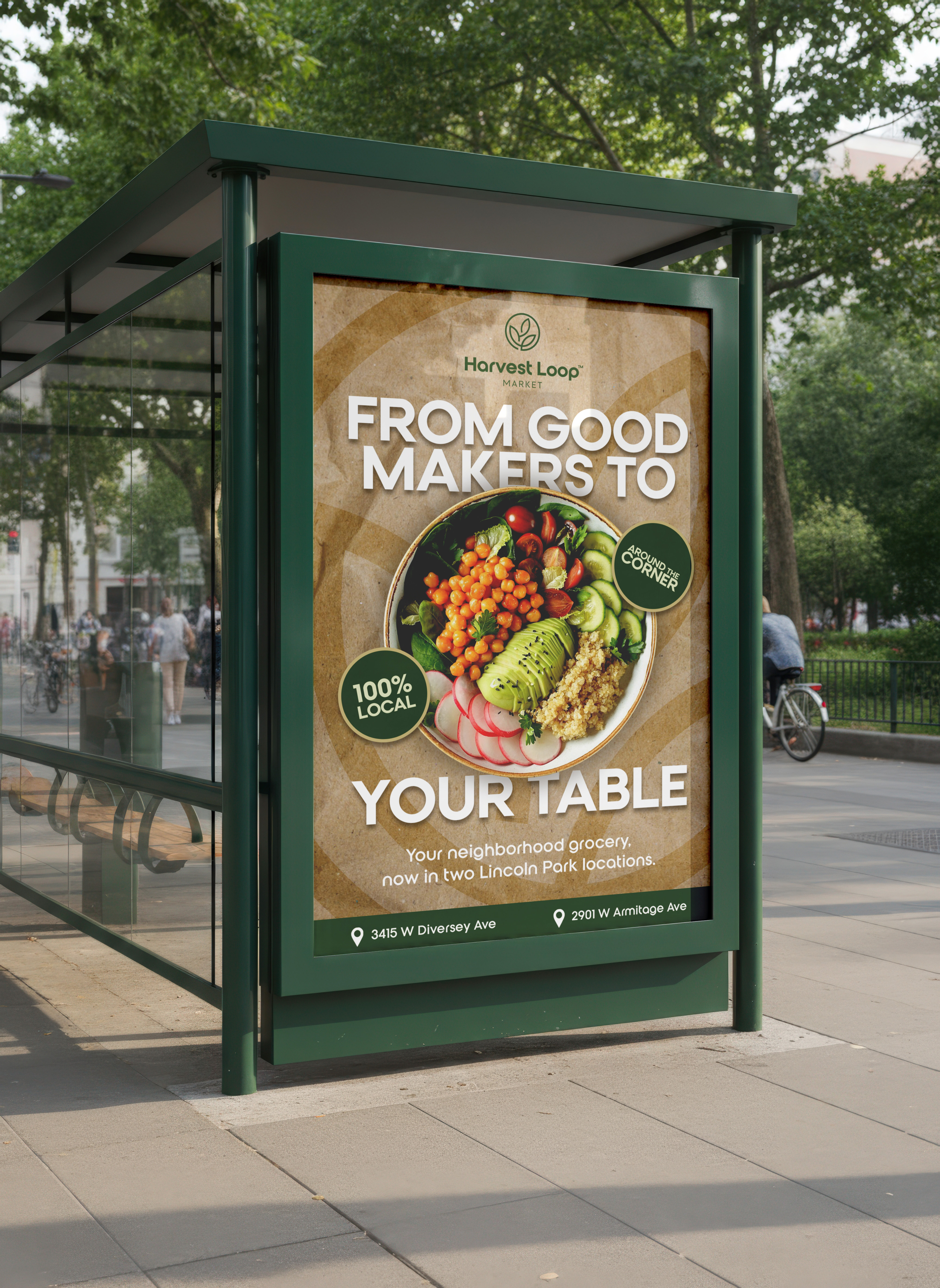
The result is a modern grocery identity that feels approachable, recognizable, and built to grow. Its bold icon creates strong visibility from a distance, while the flexible visual system gives Harvest Loop room to expand across packaging, signage, and the everyday customer experience.